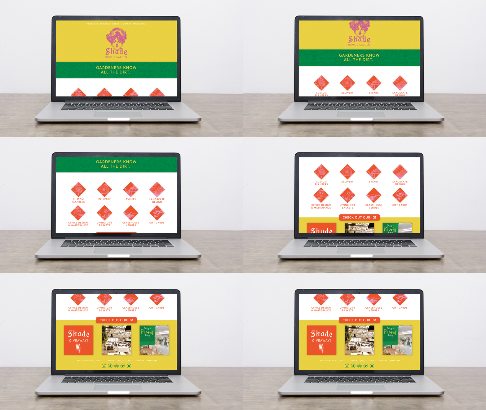
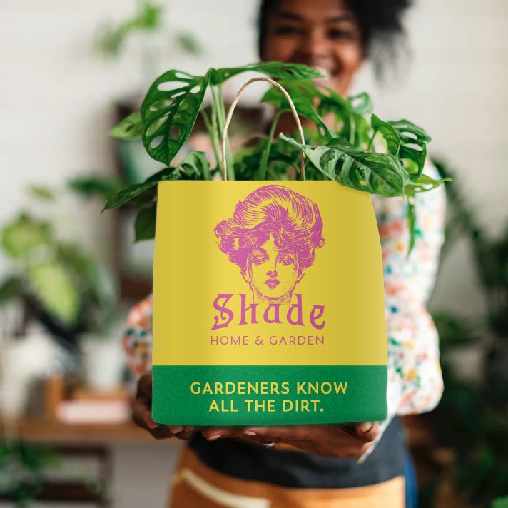
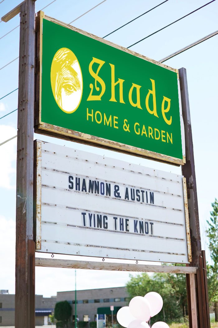
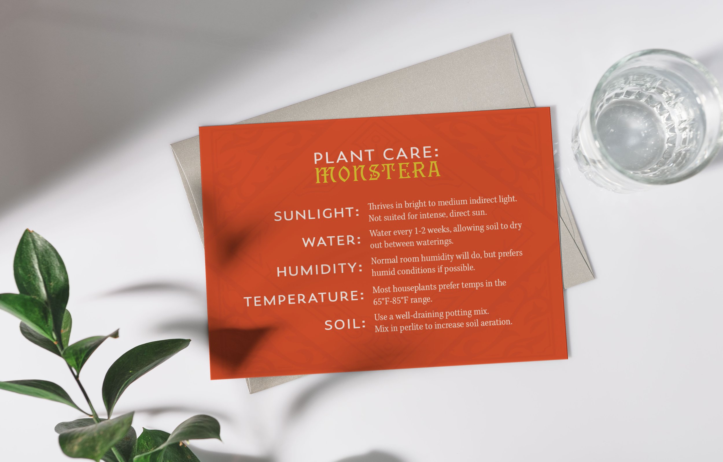
I love the plant store, Shade, in Utah county and decided to do a hypothetical rebrand.
There is a lot of potential for growth by elevating the look with bold colors, illustrations, & fonts.


I wanted to lean into the idea that Shade could be a place for female empowerment, like how it is now, but adding character and personality with the Gibson Girl illustration. To me, she looks like she knows all the latest gossip.
I was inspired by Victorian “lovers eye” lockets for the secondary logo and incorporated vectorized victorian illustrations with bold colors to give it a contemporary edge and contrast against the neutral plant colors.
Here is their current website where you can see the branding that is in the store now: https://shadehomeandgarden.com

